Blog
35 Years of Type – Part 2: Designing for a Bigger Audience
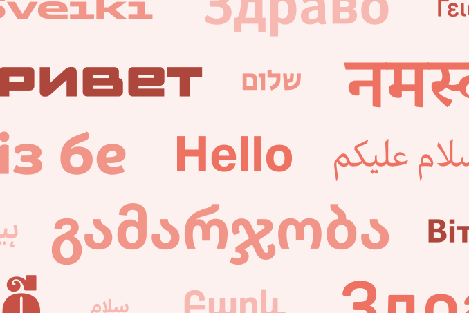
September marks 35 years of Dalton Maag. Over that time, good typography has become an expectation for all, not a luxury for a few.
 Find out more
 35 Years of Type – Part 1: From Desktop to Everywhere
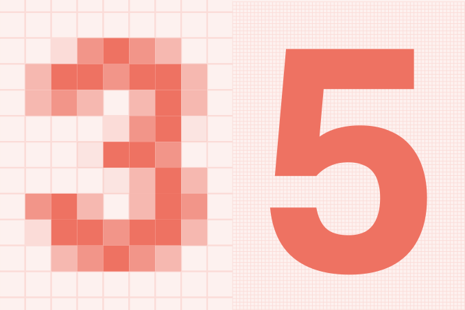
September marks 35 years of Dalton Maag. But this post isn’t about us – it’s about type’s transformation from specialist resource to everyday infrastructure.
 Find out more
 Optical Sizes: Why They Matter (and Where They Don’t)
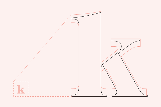
First ubiquitous and then virtually forgotten, optical sizes eventually made a comeback – and for good reasons – but are they always the best solution?
 Find out more
 Don’t Fall for It: The Trap of Over-Rationalizing Design
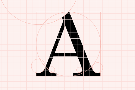
Rigid geometry harms typographic legibility. Successful visual design must balance mathematical order with the idiosyncrasies of human perception.
 Find out more
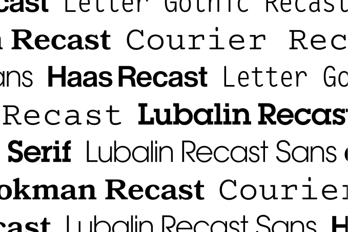
 Recasting the Past: Going Back to Paper for a Better Future
Moving from metal to digital type compromised much of our typographic heritage. To build digital fonts for the future, we must return to their physical origins.
 Find out more
 Font Licensing is Broken. Here’s How We’re Fixing it.
We need a radically simplified approach to font licensing that puts transparency and fairness first.
 Find out more