Optical Sizes: Why They Matter (and Where They Don’t)
First ubiquitous and then virtually forgotten, optical sizes eventually made a comeback – and for good reasons – but are they always the best solution?
Published on

By its nature, type looks and reads differently depending on the size at which it is set. A serif font designed to shine at large sizes may appear too fragile for optimal readability when used at smaller sizes. Similarly, fonts designed for text may lack the necessary grace when set in a headline. Choosing a typeface fit for the size of use is crucial to communicating effectively to audiences.
In some situations, the ideal solution is a single typeface which has been designed with dedicated versions, optimized for different scales, while maintaining a consistent expression across its size range. These versions are known as ‘optical sizes’.
Rise and Fall: A (Very) Brief History of Optical Sizes
From the early days of type founding, artisans known as punchcutters would create type for small sizes using their precision tools on letters only a couple of millimetres tall. When cutting type for larger sizes, they’d be working at a larger and more comfortable scale instead. The design of the letters was deliberately adjusted to display optimally across small and large sizes; type was made directly at the scale at which it would be used.
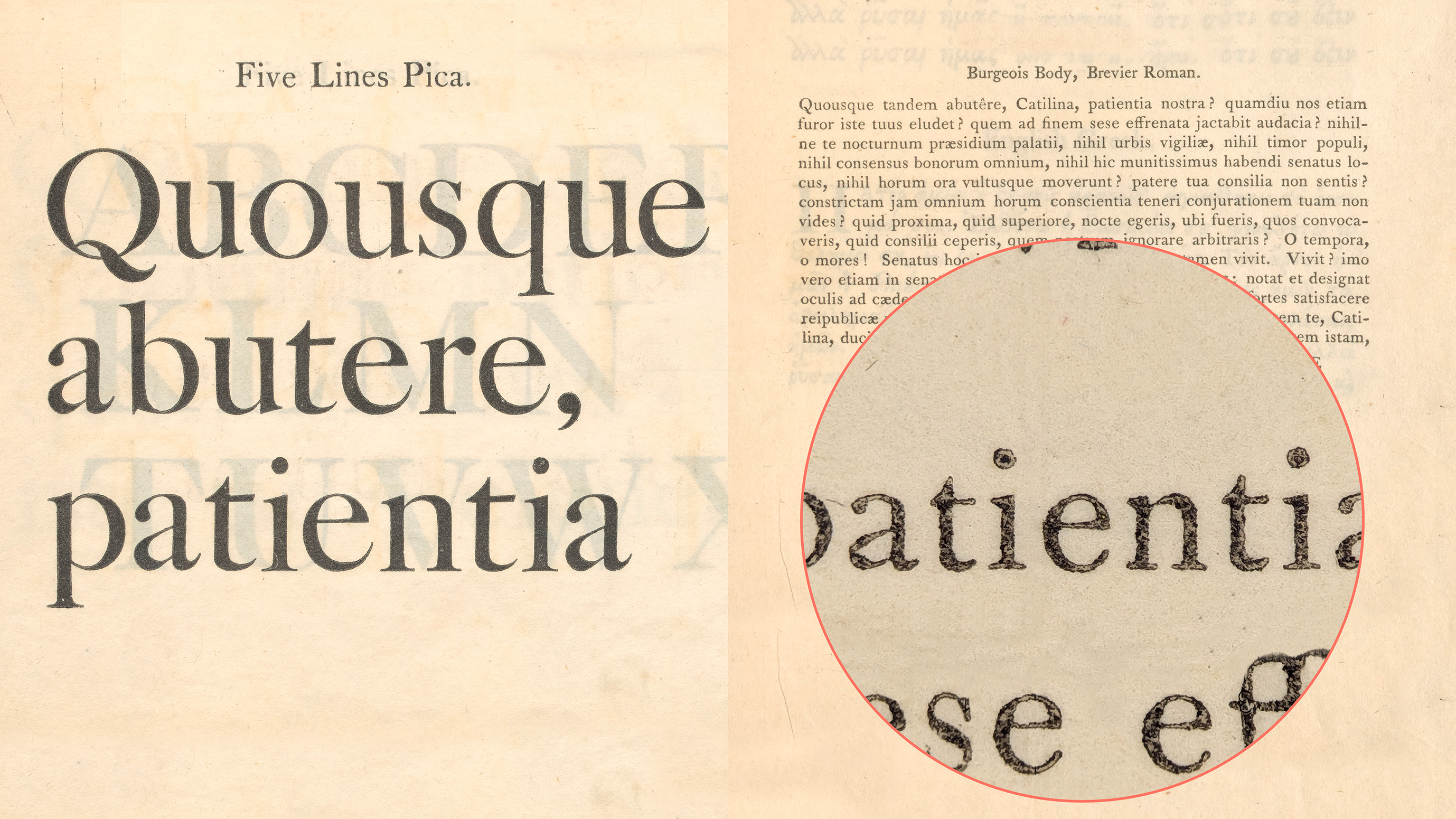
The approach remained standard for centuries, until technologies eventually emerged that provided ways of scaling physical type. From the late 1800s, the pantograph allowed foundries to derive different sizes from one set of drawings. In the second half of the twentieth century, phototypesetting – and then digital typography – allowed users to scale type at will when setting it. The size at which type was made, and the size for which it was used were decoupled. A single design could now scale up and down to all sizes – including those it was never meant for – and our eyes grew accustomed to it.
These different technologies did provide solutions that included optical sizes. But it was a lack of practicality that often limited their adoption, and encouraged the use of one single design across all different sizes – large and small – with no adjustments. From the early 1990s, for example, support for optical sizes in a single file was in theory provided by the Multiple Master technology. It was exploited by several fonts, but failed in the market by the end of the decade due to the poor software support of the time.
Variable Fonts and the Resurgence of Optical Sizes
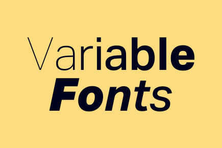
Things began to change with the introduction of variable fonts in 2016. Variable font technology allows its users to access multiple variations of a typeface through a single, compact font file1 – the ideal environment for the return of optical sizes. Just as variable fonts designed with a weight axis allow the weight to vary with a simple slider, so too can users adjust optical sizes for fonts which include an optical size axis. Variable font technology has made optical sizes logistically much easier to exploit.
Today, optical sizes exist on the iPhone, where the UI system font adjusts automatically depending on the size at which it’s displayed.2 This is a great example of responsive typography. It happens without the reader noticing, and that’s exactly the point; it is a trick that belongs behind the scenes, making the user experience effortless. Optimizing a typeface for the size of use is something that the person setting the text should not have to worry about.
When a certain font size is set in applications such as Adobe InDesign and Figma3, the most suitable variation on the optical size axis can also be picked automatically by the software without having to load new fonts.
On top of representing a big leap forward in our ability to provide an accessible user experience, these advancements are great news for designers and brand managers alike. The functionality can simplify their lives, reduce the effort of distribution and implementation, and improve brand consistency. But as with anything automatic, users also relinquish a degree of control.
Where Optical Sizes Don’t Make Sense
Although variable font technology makes optical sizes far easier to use, they are not a panacea. There are distinct scenarios where they are unnecessary, impractical, or can even work against the design brief.
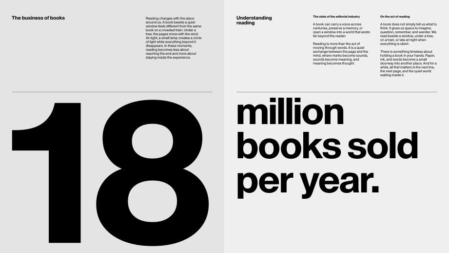
- When Design Demands Contrast: Optical sizes are engineered to maintain a consistent typographic expression across different scales. However, many brand identities and editorial designs rely on visual differentiation between expressive display and neutral body copy. If your headlines require a style that falls outside the visual design realm of your body copy, optical sizes won't help.
- When the Brief Demands Simplicity: For many contemporary projects, a couple of weights of a single typeface can cover all uses. After all, that is how much of the great graphic design of the twentieth century was done. If the chosen design reads comfortably in the most demanding context (small text sizes), you may only need different weights and widths to cater for headlines.
- When Automation Overrides Intention: Enabling automatic optical sizing delegates control from the designer to the font developer. Layout engines rely on the mapping rules built into the variable font to decide which optical variation to use at a given size. If these have not been set properly, the application will automatically use an unsuitable optical variant, leaving you with wrongly proportioned type.
The Case of Tyburn
But what happens when a brief does demand a seamless, consistent typographic expression across substantial shifts in scale? This is precisely where optical sizes become essential. Our recent library release, Tyburn, is an example of a typeface designed to flex throughout sizes in the most complex and sophisticated editorial settings. Just like the work of Claude Garamond that it’s based on, Tyburn is carefully optimized for different sizes of use. It maintains a consistent appearance regardless of scale, by means of meaningful design adjustments. For things to look the same when in use, our font developer Deiverson Ribeiro had to make them different.
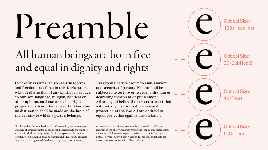
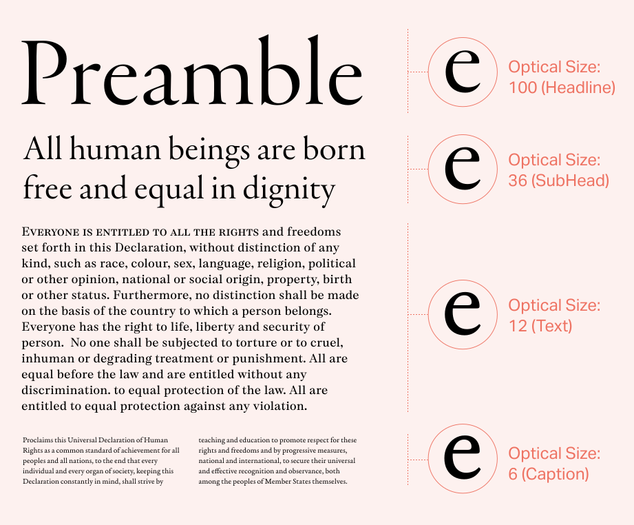
Tyburn covers a range from Caption to Headline, with defined instances for Text and Subhead. The Caption cut is designed to enhance the reading experience at very small sizes. Copy needs to ‘breathe’ well there, and therefore benefits from open letter spacing and generous proportions, and robust strokes and hairlines. By contrast, the Headline cut is made to shine where words are to be looked at just as much as they are to be read. Hairlines appear fine and delicate, letter spacing is tighter, and proportions more compact. These two extremes, and all variations in between, are delivered in a single file and are accessible through the Optical size axis slider, helping to solve a wide range of different design problems.
Conclusion
Optical sizes provide the most sophisticated way of fine-tuning your typography to context, contributing greatly to an accessible, consistent reading experience. Variable font technology has made them simpler to package, compact in file size, and easier to implement. We are and will be seeing more and more of them, as our interfaces and devices keep evolving their capabilities to automatically respond to the context of use.
However, optical sizes still require careful and critical choices on the user side. It is essential to know when a project demands the seamless continuity of an optical size family, versus when it requires the stark contrast of mixed expressions. Good typography always benefits from an attentive eye.
Notes
- Back to reference 1.
See our Introduction to Variable Fonts
- Back to reference 2.
See Apple’s Typography guidelines
- Back to reference 3.
See Adobe’s Using fonts in InDesign




Related Pages
Tyburn
Recasting the Past: Going Back to Paper for a Better Future
Variable Fonts