35 Years of Type Part 2: Designing for a Bigger Audience
September marks 35 years of Dalton Maag. Over that time, good typography has become an expectation for all, not a luxury for a few.
Published on

The World Got Bigger
Latin by Default
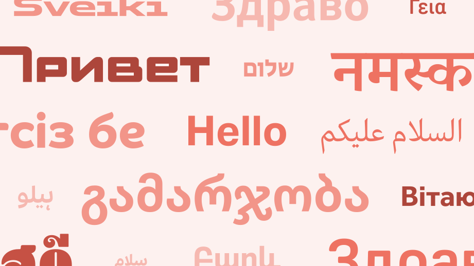
In 1991, much of the Western software industry effectively treated the Latin writing system as typography, and everything else was rare, specialist language support. Unicode changed that by giving the world a common way to represent the characters needed for written languages; the world finally stopped speaking ASCII.
What users had once regarded as niche, specialist support became something they expected from all professional typography.
Unicode provided the characters, OpenType provided the mechanisms, and better software and shaping engines made deployment practical. Together, they made it possible for a single font file to support multiple writing systems seamlessly with increasingly sophisticated behaviour.
Design Standards
Expectations have moved on from ‘Can it display the language?’ to ‘Can it typeset the language?’ and, ultimately, to ‘Is it actually good typography?’
Designers and organizations have had to learn that localization isn’t enough. Typography has to work culturally and aesthetically in every writing system it supports. Better international support has raised the standard of typeface design rather than narrowing its expressive possibilities.
Video by Lippincott; Hangul designed by SandollTium.
Emoji Took Over
A cynic might suggest that Unicode is now just 4,000 emoji with some letters added as an afterthought, but the truly international nature of emoji is no joke. In just a few decades, we’ve seen the birth, development, and standardization of a truly global visual vocabulary.
While traditional typefaces give written language a tone of voice, emoji provide the body language. They’re used as tone indicators, exclamation marks, and expressions of endorsement all at the same time. It would be a mistake to treat emoji as a novelty – they are a fundamental part of modern digital typography.
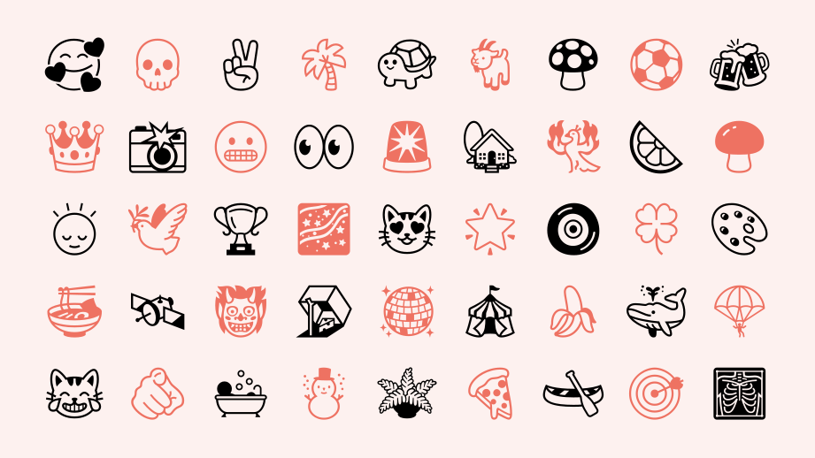
Emoji are the ultimate test of universal design. They are not automatically universal, but are selected with care and designed with skill and insight to reach across cultures and convey meaning.
The success of emoji shows that no matter how complex our channels of communication get, we will always gravitate towards the most direct and expressive ways to communicate with each other.
Readers Matter More
Accessibility by Default
The aim of typography is communication: we write to be read. As typography moved from the printed page into digital media, the needs of the reader became more explicit, more measurable, and harder to ignore. Today, accessibility is no longer viewed as an accommodation; it is a baseline expectation for any professional design.
Legibility is UX
Legibility is now widely understood as a core UX problem, not just an aesthetic one. If users struggle to read something, they are less likely to engage with it and more likely to abandon it. While testing typography is not a new idea, the ways in which we can now test would have been difficult to imagine in 1991: we can quickly test with real readers, compare a dozen alternatives, and gather precise evidence for what actually works.
Character without Compromise
But accessible typography does not have to mean bland typography. We have learned that typefaces can be highly legible and still retain a distinctive character. Through careful testing, evidence-based design, and admittedly a lot of experience, we can make typography easier to read without sacrificing the voice that made it worth choosing in the first place.
Next, in Part 3: The Big Business of Type
Fonts have now become essential brand assets, but what does that mean for the people who create and sell them? Part 3 coming soon.




Related Pages
35 Years of Type – Part 1: From Desktop to Everywhere
Aktiv Grotesk
Korean Air Sans