35 Years of Type
Part 1: From Desktop to Everywhere
September marks 35 years of Dalton Maag. But this post isn’t about us – it’s about type’s transformation from specialist resource to everyday infrastructure.
Published on


Fonts are Absolutely Everywhere
A Desktop Luxury
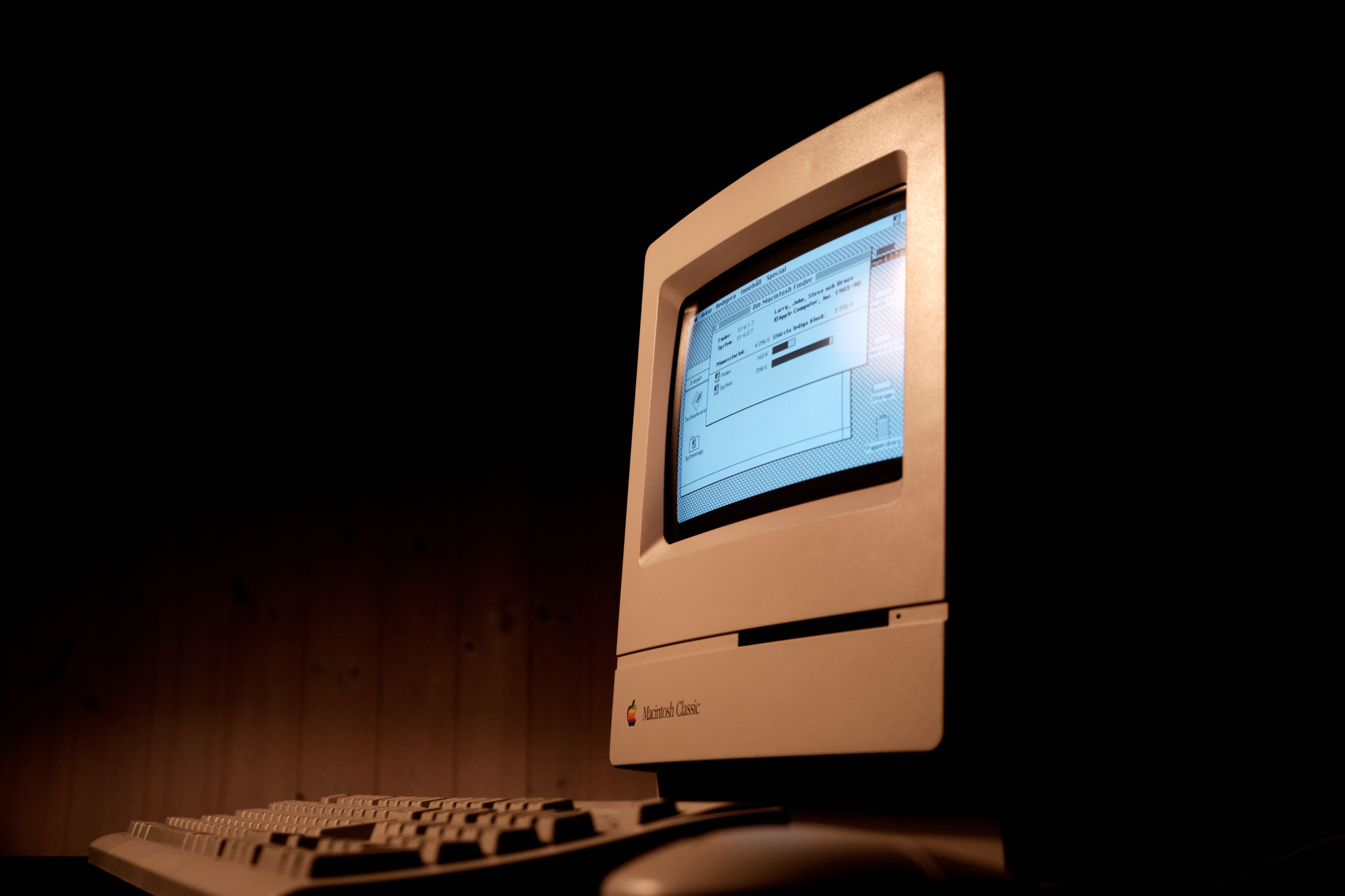
In 1991, professional-quality scalable digital typography was still a specialist resource, but that was changing fast. Adobe’s proprietary Type 1 font format had constrained the supply of high-quality PostScript fonts, but once the specification was made public, other foundries rapidly entered the market, and the number of available fonts began to explode.
If you were very lucky, your swanky new home computer might support a handful of scalable fonts, but for most users, high-quality digital fonts remained professional design assets: expensive, distributed on physical media, and usually found in the offices of designers and commercial print shops; their ultimate purpose was usually to put ink on paper.
Interfaces Everywhere
Over the past 35 years, many of the devices we own went from being ‘just a machine’ to being ‘a screen with a machine attached’. By necessity, fonts went from being professional design assets to everyday infrastructure: used across websites, apps, cars, televisions, games, kitchen appliances, and wayfinding systems. Fonts aren’t just for reading anymore – we use them to run our lives.
Technology Progressed
More Pixels, Less Guessing
The revolution started when cathode-ray tube (CRT) monitors got bigger, brighter, and more precise, while mainstream graphics hardware went from delivering around 300,000 pixels per frame to nearly 2 million. With more pixels came clearer, more faithful font rendering. You could finally identify a typeface on screen more precisely than ‘sans’ or ‘serif’.
The Rise & Decline of LCD
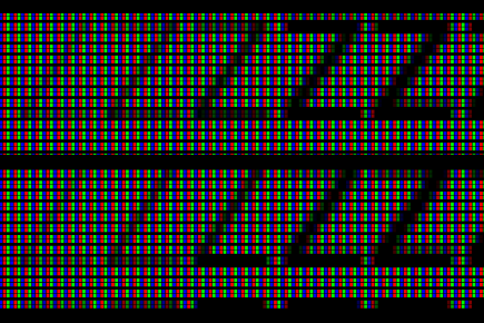
As LCD displays got more common, first on laptops and then on desktops, they killed off CRTs and changed the problem of rendering type on screen. Instead of the analogue smears of a CRT, LCD pixels have sharply defined red, green, and blue subpixels. Font rendering could exploit these to give an apparent increase in horizontal resolution, alongside real increases in native display resolution.
But then the screen stopped being so predictable. Many mobile OLED displays abandoned the familiar RGB stripes for arrangements such as PenTile, which exploit differences in human visual sensitivity. Rendering systems increasingly took responsibility for adapting virtual pixels to each physical display, while higher pixel densities reduced the need for font-specific tricks. Typeface designers could now trust the screen to preserve details that once had to be exaggerated or simplified for the pixel grid.
The death of hinting (instructions that help letterforms conform to the pixel grid) has been predicted for decades, but it never quite dies. Fonts are expected to work across an ever-widening range of devices, including lower-resolution ones, even as better screens make painstaking adjustments unnecessary.
And expectations moved in the opposite direction. As the compromises of display technologies became less visible, users became less willing to accept them. Fonts are now expected to work not on a handful of professional desktop displays, but everywhere.
More Power
Today, a low-end mobile phone has orders of magnitude more computing power than a professional desktop computer from 1991, with about 1,000 times as much memory. What was a struggle to rasterize in 1991 is now done in the blink of an eye.
The consequence is that fonts can now afford to be much more ambitious. Font files can be larger and more demanding without overloading the devices that use them. The challenge is increasingly what typeface designers and engineers can reasonably build, test, and maintain.
OpenType
Thanks to the modern marvel of international standards, a TrueType font built in 1991 can still be used on today’s devices. But today’s users expect more than that. Professional TrueType-based OpenType fonts released in 2026 often contain more glyphs, support more writing systems, offer more features, and include more behavioural rules that applications can use to shape and position text correctly.
Font files have evolved from comparatively compact packages of glyph outlines, metrics, and instructions into complex pieces of software; in professional typeface design studios, fonts are no longer simply edited – they are compiled and built.
Webfonts
You don’t get more worldwide than the World Wide Web. The need for multilingual, multiscript communication was there from the beginning, but well-considered typography took a while to arrive. Webfonts, alongside sensible licensing models for using them, allowed designers to move beyond a small set of reliable system fonts and bring proper typographic variety and specificity to the browser.
In the process, the browser became the most complex typesetter that most people will ever meet. It has to reliably shape, position, and render text across writing systems, devices, display technologies, and operating systems.
Variable Fonts
There had been earlier attempts to make a single font file vary: first Adobe’s Multiple Master fonts, then TrueType GX, but the idea finally took hold with the arrival of OpenType variable fonts in 2016.
Variable fonts changed both how we build fonts and what designers could reasonably expect a typeface to contain. Historically, every expansion of a conventional static font family meant more files, more disk space, and more data to move around. Variable fonts changed the equation: a single, compact file could suddenly contain an entire family – a full range of styles, weights, and widths.
They helped make larger families more practical; tiny, four-style families are no longer the norm. Outside of display fonts, we’re seeing consistently bigger families: more weights, more widths, more writing systems, upside down, and backwards in heels. This is increasingly the new baseline for professional-grade font families.
Everyone Demands More
In 2026, expectations are justifiably high: today’s users expect typography to work everywhere, and they are increasingly unwilling to accept compromises regardless of device or medium.
Next, in Part 2: Designing for a Bigger Audience
Now that we have highly capable fonts that can adapt to resolution and environment so successfully, how can they serve people effectively? Part 2 is now available.




Related Pages
35 Years of Type – Part 2: Designing for a Bigger Audience
Variable Fonts
Screen Optimization