Don’t Fall for It: The Trap of Over-Rationalizing Design
Rigid geometry harms typographic legibility. Successful visual design must balance mathematical order with the idiosyncrasies of human perception.
Published on

Designer Beware
As visual designers, we know all too well the temptation to justify creative decisions with pure geometry. Alignments and rules help make sense of shapes, reassuring us that we are consistent. But when it comes to type, there is a line beyond which rationalization starts to impede clarity and even legibility. Embracing the shape of letters as they naturally are will make for more successful typography. It is the balance between order and idiosyncracy that makes great design great.
The Purity Falsehood
Contrary to what many believe, when letters are constructed modularly from purely geometric shapes, they aren’t rendered as their true essential selves. Until the printing revolution, letters were always written or drawn by the human hand using a variety of tools and surfaces, all of which inevitably influenced their form. So, although Latin letters are based on simple, round, and rectangular shapes, they were never ‘perfect’ to begin with. From their most primitive beginnings, to medieval calligraphic styles, and to contemporary digital type, they have constantly evolved and adapted to the needs of their time.
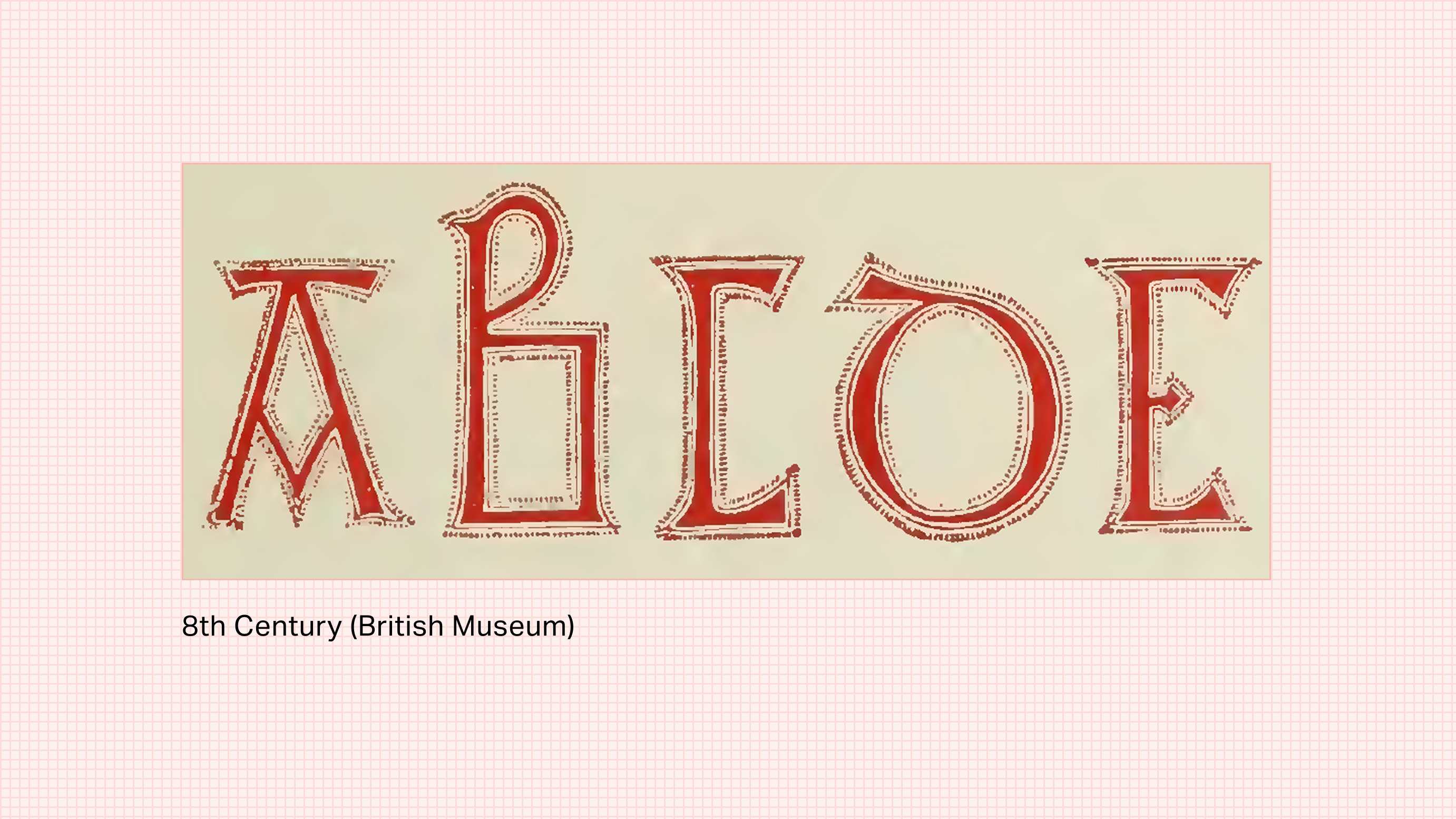
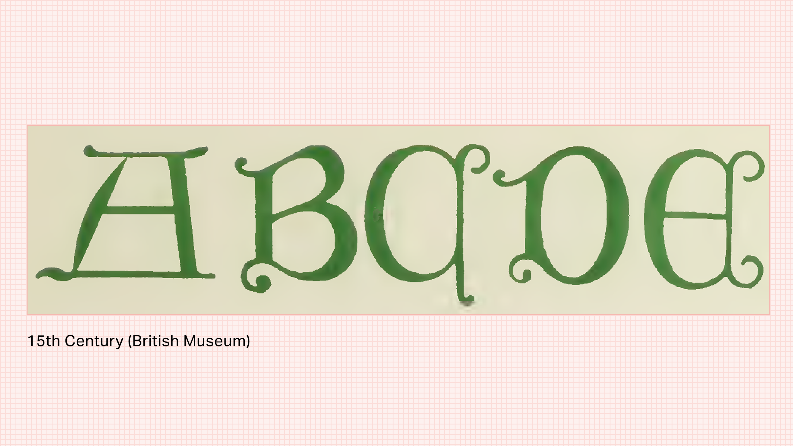
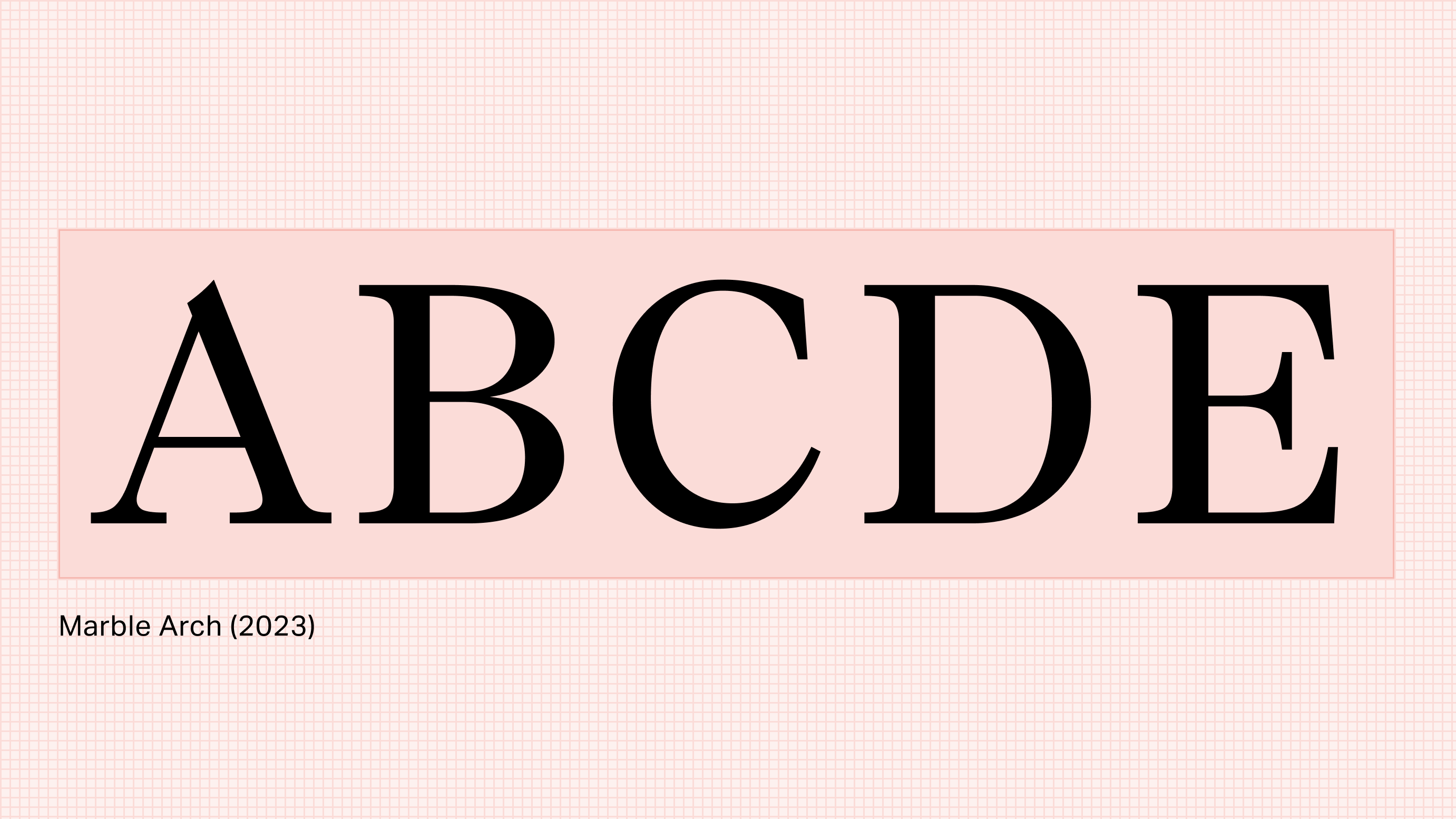
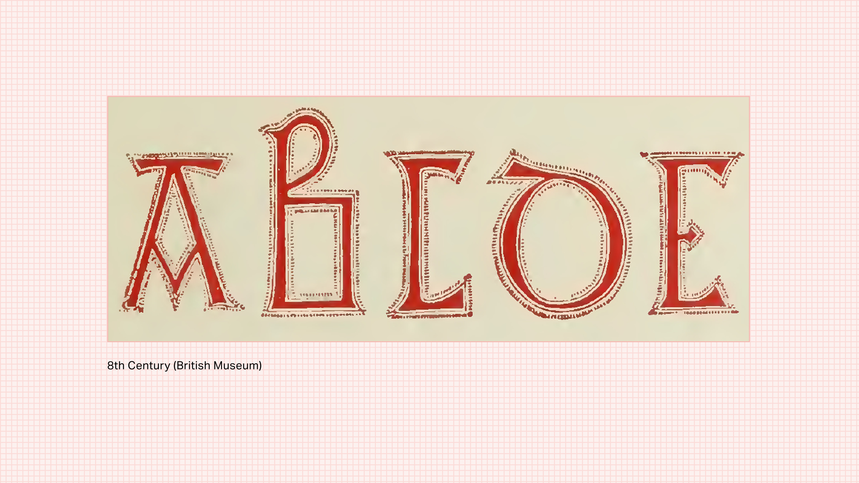
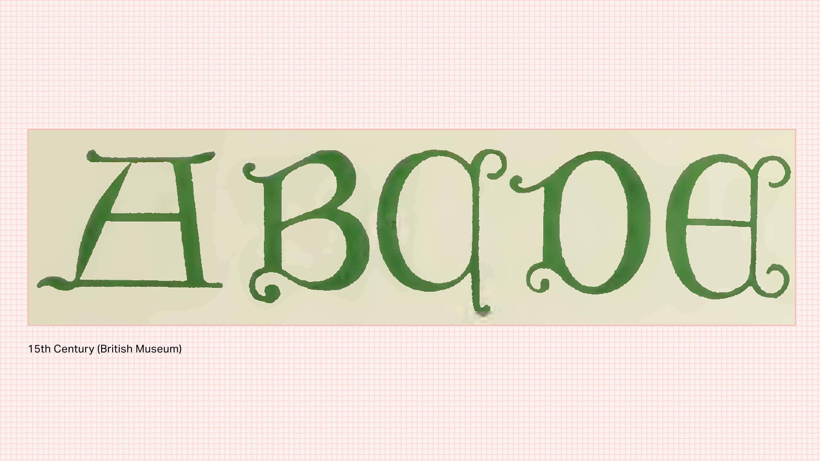
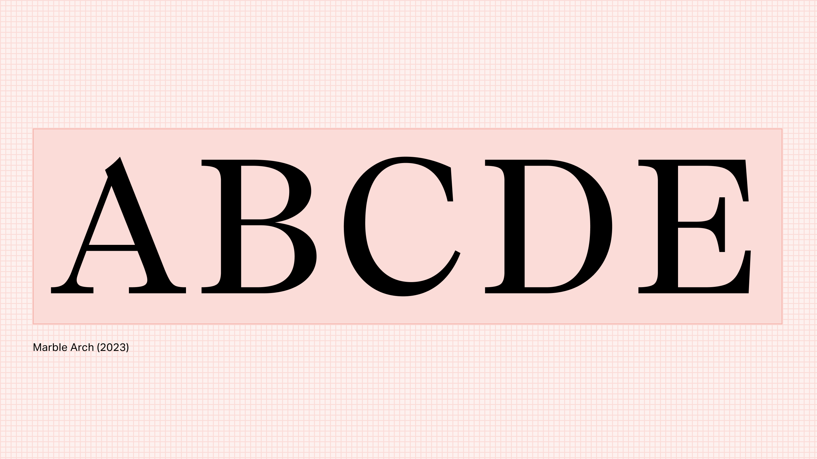
Not only are purely geometric forms not the essential truth, they can also be detrimental to legibility. While reading, our eyes travel across a line of text, allowing our visual system to identify letterforms with a combination of focal and peripheral vision. The easier it is to disambiguate letters, the more efficiently we read and absorb the content. When letters are all made up of geometric circles, or are overly modular, they become much harder for our visual system to differentiate.
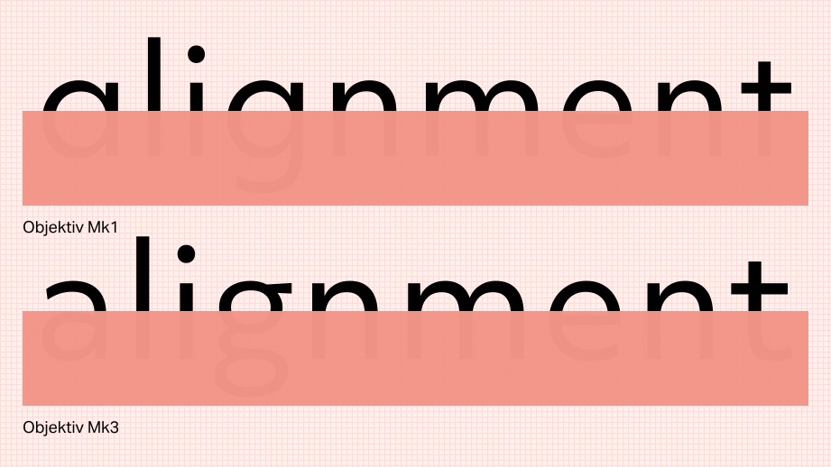
Curb Your Instinct
So why are we so compelled to make disparate shapes align to each other, or have symmetry where there is no need for it? It could be that, just like in the past, our design instincts are responding to the circumstances of the time. Nowadays, in the environments in which we design, we are inundated with grids and guides, and tools that make it incredibly easy to copy, paste, and flip elements. This might explain the instinct, but it doesn’t excuse it.
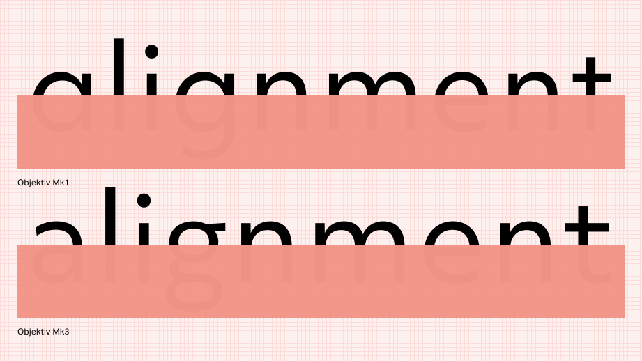
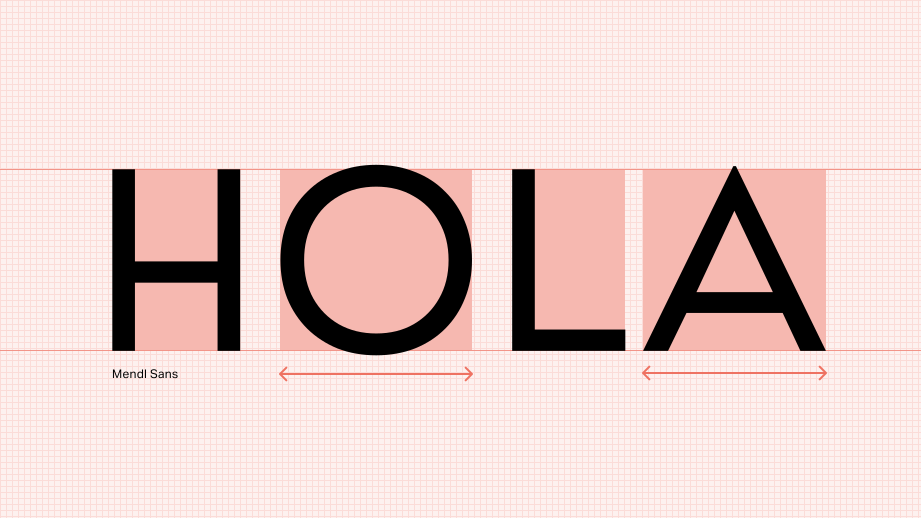
What’s the better choice? Being content in the fact that an ‘O’ is different from a circle. Knowing that it needs to be taller than rectangular letterforms in order to compensate for the whitespace around its poles. Appreciating the extra weight around its equator that prevents it from looking top-heavy or bottom-heavy. Understanding that, because of the ample whitespace around it, it needs to have tighter spacing so as not to cause gaps.
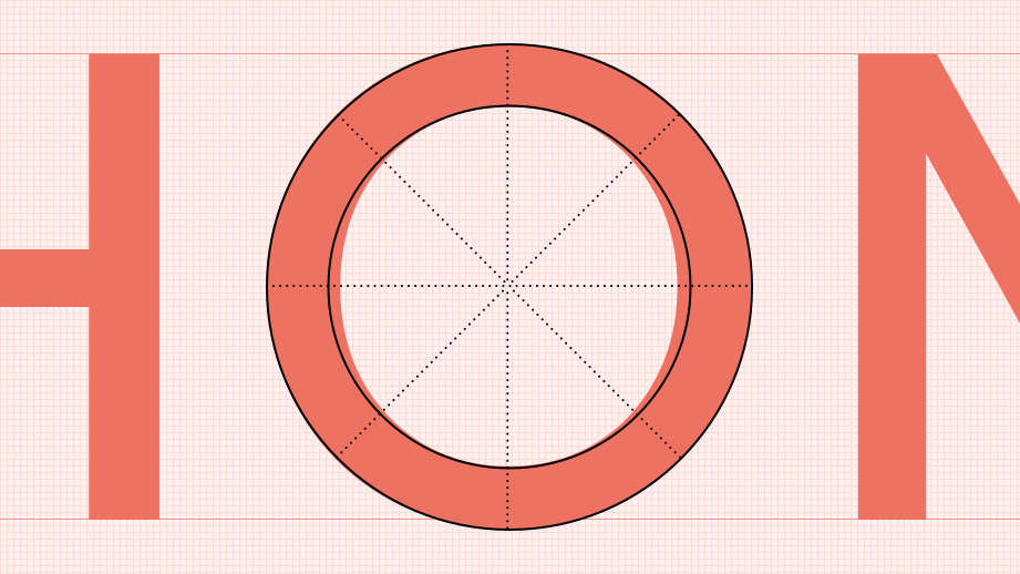
These are just a few of the optical, logical, and necessary idiosyncrasies that type designers introduce to counteract a great many optical illusions and legibility pitfalls. They are the steps that transform shapes into letters. We do this because it’s called for, and against our own over-rationalization instincts.
Striking a Balance
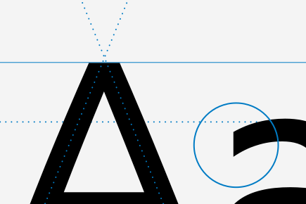
This isn’t to say that rational, geometric stylization can never be successful. As long as geometry doesn’t impede a letter’s identity, there are many engaging ways to accentuate its expression. Roundness can be exaggerated with wider-than-usual proportions without relying on geometric circles. Narrow vertices at diagonal junctions can create a strong, triangular appearance. Cohesion can be achieved without excessive repetition, which makes things more interesting – like a double-storey ‘g’ that breaks the pattern of geometric symmetry in ‘b’, ‘d’, ‘p’, and ‘q’.
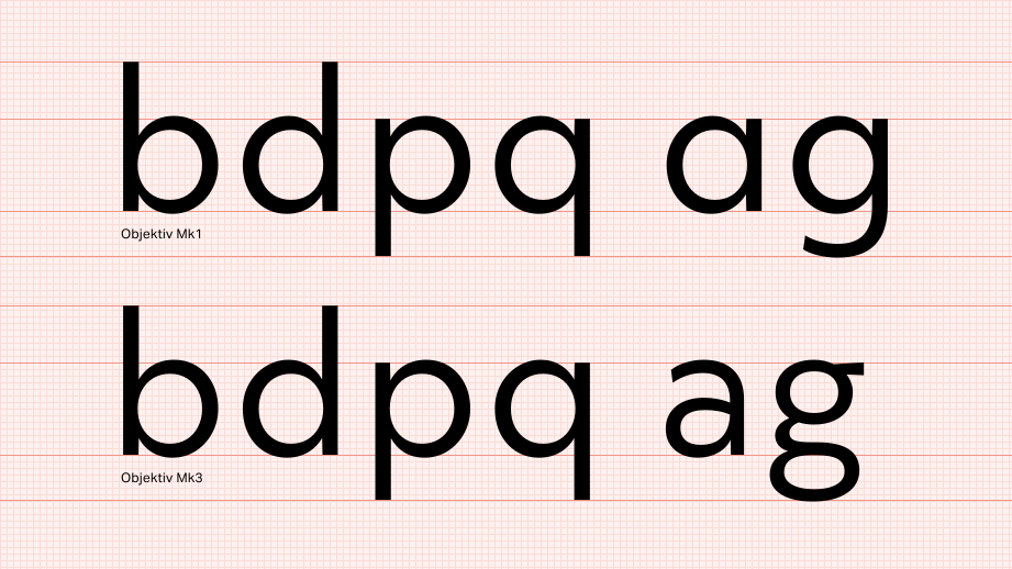
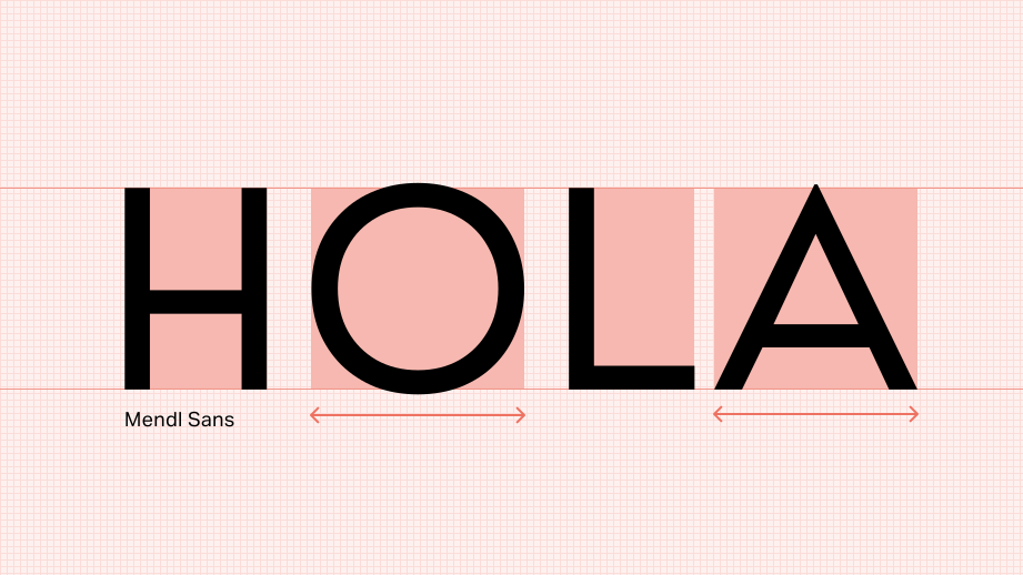
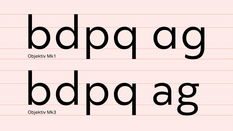
This truth extends far beyond typography to broader visual design. Balancing order with disorder – introducing small, peculiar details that don’t follow obvious rules – adds interest and dynamism. A touch of a bright-hued overlay enlivens an otherwise monochromatic, orthogonal layout. Highlighting the inherent grain of a photograph lends warmth to a stark image. A sharp diagonal tilt given to a block of text gives a poster a sense of urgency, drawing the viewer in. A logotype whose letters fit neatly into a rectangular frame, save for a single descender that breaks that frame, is embracing tension and intrigue. Welcoming nuance doesn’t mean completely suppressing our instincts; it means complementing them with a necessary opposing force to bring out their absolute best.


Related Pages
Custom Font Design
Recasting the Past: Going Back to Paper for a Better Future
Font Licensing is Broken. Here’s How We’re Fixing it.