35 Years of Type
Part 3: The Big Business of Type
September marks 35 years of Dalton Maag. Since 1991, we’ve seen our industry transformed, while the purpose of its work has remained unchanged.
Published on


Type Became Big Business
The Typeface is the Brand
35 years ago, it was not uncommon for an established, old-school designer to have spent their whole career specifying the same neutral Swiss-inspired typeface for every client in every industry at every opportunity. In 2026, this attitude would be anachronistic.
This isn’t to say that neutrality is dead; an intentionally neutral choice can give authority, flexibility, and balance to diverse written messaging. But most brands need more: they need to differentiate themselves from their competitors with a clear, unique voice across all visual media. And that is how fonts became core brand assets, not afterthoughts or defaults.
Custom Fonts Became Accessible
In 1991, custom corporate typefaces were largely the preserve of major organizations: the likes of AT&T, British Rail, Mercedes-Benz, and Volkswagen. The financial investment needed to create a custom typeface was a huge barrier, but so was the limited access to the technologies needed to exploit the resulting design.
The desktop publishing revolution of the mid-1980s, along with greater awareness of the power of typography, led to an explosion in the demand for custom typeface design. We lived this shift firsthand, growing from a one-man band in 1991 to a studio of over forty people. Today, we see brands and companies of all sizes and from all industries interested in what a custom typeface can do to help them. Commissioning a custom design is often more affordable than they expect, and for large organizations can cost far less than licensing an existing typeface from a different supplier.
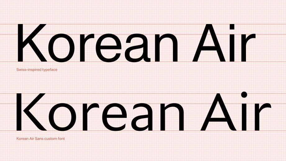
The reasons we hear remain the same: brands want complete control over their tone of voice, and they want to actually own the key assets that they rely on. Owning the intellectual property rights to a custom typeface gives a brand an exclusive typographic asset that competitors simply cannot license for themselves.
Fonts Became Measurable
Many major brands now view a typeface as they view any other investment: it has to make a difference and it has to pay its way. A broadcaster can test typeface performance with key audiences for acceptance and accessibility; savvy UX teams can A/B test typefaces in e-commerce and measure differences in sales and profit.
In 1991, typefaces were judged aesthetically and functionally, but it was far harder to tie their performance directly to results. Today, those judgements remain, but typefaces are also judged using conversion rates, user retention, audience interest, and revenue data. Typography now attracts interest beyond the art department, including in the boardroom.
Democratization and Consolidation
In 2026, there are vastly more fonts – and typeface designers – than there were in 1991. It’s easier than ever to start creating a typeface, but the demands of professional production are also far greater.
In 1991, producing a professional font and getting it into a designer’s hands was difficult; distribution channels were tightly controlled and the barrier to entry was high. Licensing online changed that. Today, a typeface designer can easily release a new family and have licences available to buy globally the same day. The result is vastly more opportunity, but also vastly more competition and much less visibility for any individual release. Just getting seen is more than half the battle.
While font creation and publishing have been democratized, commercial distribution has moved in the opposite direction. Many of the retail platforms that grew over the past few decades have consolidated, greatly reducing competition amongst distributors. For those licensing fonts – design studios, agencies, and brands – this concentration has meant less choice, higher prices, and curation designed to benefit only the platform.
We have been very lucky over the past 35 years to grow a sustainable business solely from fonts. But the broader market suffers from a damaging tension: intense competition between typeface designers on one side, and a lower revenue share from consolidated commercial distribution platforms on the other.
But Black & White Still Dominates
Across these three posts, we’ve seen 35 years of progress, change, and innovation; 35 years of more designers, more users, and more demands; 35 years of aiming to meet needs exactly and without fuss – but our fundamental purpose hasn’t changed. We have dramatically better tools, font formats, screens, distribution, language support, and engineering, but we’re still arranging dark and light shapes so that one human being can communicate with another.
Written letterforms have had the power to endear, outrage, and persuade for far longer than fonts have existed. The technology around type doesn’t stand still, but the reason we make it remains constant: to give written language a voice.


Related Pages
35 Years of Type – Part 1: From Desktop to Everywhere

35 Years of Type – Part 2: Designing for a Bigger Audience
Font Licensing is Broken. Here’s How We’re Fixing it.